Style Guide

How to... Web Essentials

Font Styles

Styles Size Color/HEX Color

H1 Title

42px Dark gray #272727

H2 Title

32px

Dark gray #272727

H3 Title

21px

Dark gray #272727

H4 Title

18px

Dark gray #272727

H5 Title

16px

Black #292929

H6 Title

14px

Black #292929

Body/Paragraph

16px

Gray #666666

Hyperlink

[dictated by brand colors]


How to...

The font type & size is controlled through your website's theme. To keep styles consistent throughout your site, use the Paragraph dropdown menu in the WYSIWYG ("What You See is What You Get") editor:


Note

  • H1 titles, found on interior page main banners, should be reserved for SEO & web accessibility purposes

Button Styles

Options CSS Wrapper Class

Primary Button

make-buttons

Secondary Button

make-buttons secondary-btn

Outline Button

make-buttons outline-btn

make-arrow-link

Dark Button

make-buttons dark-btn

Gray Button

make-buttons gray-btn

White Button

make-buttons white-btn

White Button

make-buttons white-outline-btn


How to...

Start by creating a regular text link. Next, highlight and italicize the text that was just hyperlinked:sg5.png

To enable the design, add a make-buttons class to CSS Wrapper Class Name field:

Save (Publish).


Note

  • you'll need to Preview or Publish to see the button (styling does not appear in editing mode)
  • if the button styling does not appear, check the HTML source code, the italic emphasis <em> tag must live outside the hyperlink <a> tag to enable styling
  • example: <em><a href="http://website.com">Button Example</a></em>

Background Styles

Style CSS Wrapper Class Description
bg-black black background
bg-primary-dark primary color with black overlay
bg-primary primary color
bg-primary-light primary color + white overlay
bg-primary-medium-gray primary color + dark gray overlay
bg-primary-light-gray primary color + light gray overlay
bg-secondary-dark secondary color + black overlay
bg-secondary secondary color
bg-secondary-light secondary color + white overlay
bg-white white background 

How to...

In Page Designer view, "Edit This Page", select the layout row that you wish to add a background color to.

Next, add your desired background color CSS class and set the row to Full-width row, example: sg5.png

Save (Publish).


Note

  • you'll need to Preview or Publish to see the button (styling does not appear in editing mode)

Table Styles

Style CSS Wrapper Class
default / no CSS class
plain-table

How to...

The default table styling is alternating white and gray lines. 

To create a simple table, add the CSS Wrapper Name plain-table to the content item:


Note

  • best practice: unless specifically for data, avoid using tables as they are not mobile friendly

Image Management

Component Minimum Recommended Size
public homepage hero or slider: 1400 W x 400 H
member homepage slider: 600 W x 200 H
promo cards: 600 W x 200 H
blog feed thumbnails:   240 W x 140 H
event feed thumbnails:   250 W x 140 H
CTA images: 500 W x 250 H
team/bio headshots: 230 W x 180 H
sponsor sliders: 200 W x 150 H

Note

Occasionally, after uploading and inserting an image, the image may be missing a snippet of code that would automatically resize it. If your image is too large and your layout looks off:

  • open the HTML Content Item that houses the image
  • next, open the WYSIWYG editor and click on HTML 
  • in the the Source Code window, insert the following code, class="img-responsive"

Post a Blog

There are several ways to access the Post a Blog module, including directly from a Community. 


How to...

Your blog/news feed page will likely have a Post a Blog (ADMIN) button, viewable to logged-in Super Admins only:

Click the button to open the Blog Editor module page. Here, add a title, body text, images, etc. You can also edit the permalink date if back-dating articles:

At the bottom of the Blog Editor module there are several settings including Who can ready your blog entry? and Who can make comments on this?. If you leave the Associate this post with a community as blank, the post will publish to the open forum/main community. 

Finally, select one of the options to Publish, Schedule, Save as Draft, Delete Draft or Cancel.


Note

  • the first image, at the top of a blog post, is what will appear as the thumbnail image in the news feed
  • blog post image sizing that will fit thumbnails:
    • 240 width x 140 height (minimum)
    • 480 width x 280 height
    • 720 width x 420 height
  • to add a tag to your post, open the blog after Publishing. In the bottom left of the post, click Add a tag to open a list of pre-populated tags
  • if there are no tags in the list and/or to create new tags, navigate to the Admin view and go to: Admin > Settings > Tags and Mentions > Tags
  • learn more about managing and creating blogs

Add an Event


How to...

Navigate to your upcoming events feed list. While logged-in as a Super Admin, select the Add button:

Add a Title and select the appropriate Event Type. If the event is specific to a particular community and you'd like to restrict it to those members, also select a Community

Fill out the remainder of the fields and select Save and Continue, Save, or Cancel.


Note

How to... Web Components

Content Cards

Style CSS Wrapper Class
card
card img-card
card bg-primary
card bg-secondary
card bg-gray

How to...

Assign a CSS Wrapper Class to a content item intended to display as a card.

Save (Publish). 


Note

  • the img-card class crops images at 200px height + variable width depending on screen size
  • use the plain card class to display an image without cropping 
  • any style button class can be added to a card (but only one button class per card)

Headshot + Bio Cards

Style CSS Wrapper Class
card team bio-#
bio bio-#

How to...

When creating new headshots, it's best to copy and paste existing items from the Sticker Sheet rather than creating new.

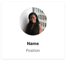
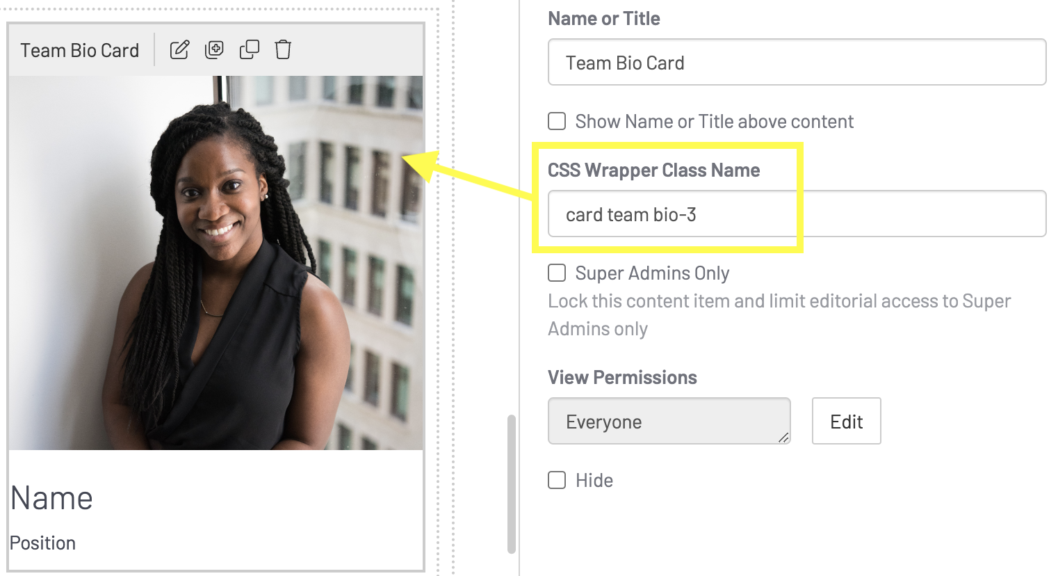
First, select the top content item, Team Bio Card, and add/edit a photo and update the name and title.

Make sure to assign a card team bio-# CSS class, replacing the # with a unique number or name. Example, card team bio-3:

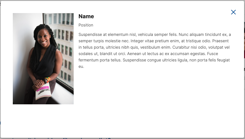
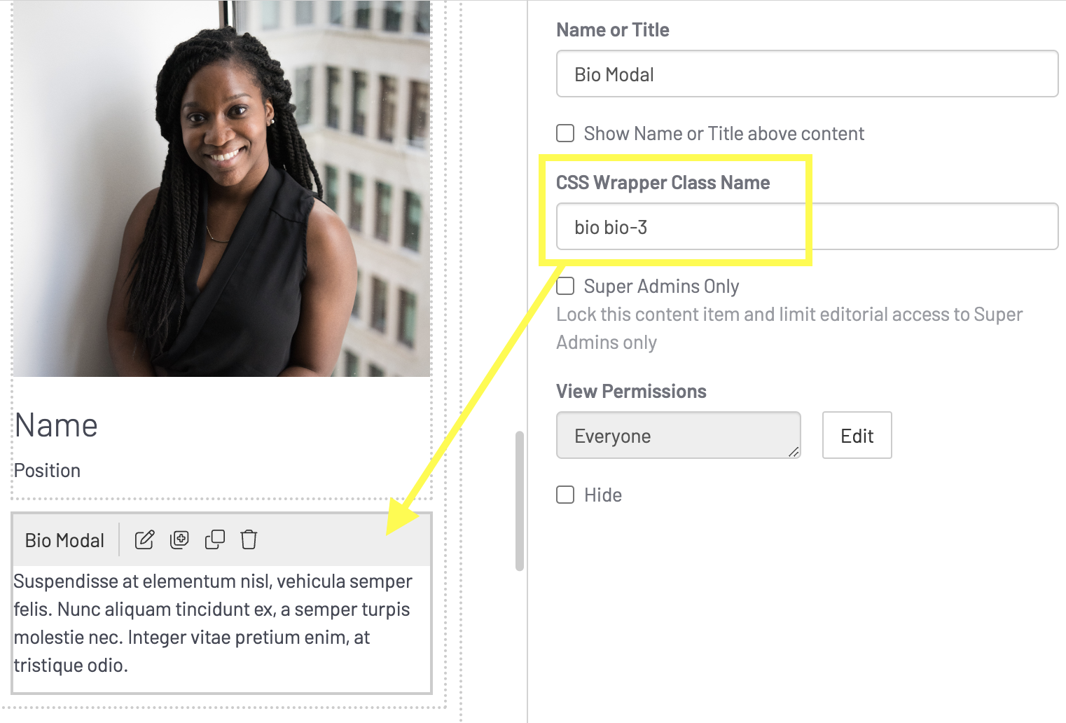
Next, select the bottom content item, Bio Modal, and add/edit the biographical text that will appear on the pop-up. 

Make sure to assign the modal a bio bio-# CSS class, replacing the # with the same unique number or name as the team bio card. Example, bio bio-3:

Save (Publish)


Note:

  • For a headshot card and biography pop-up to work, the two content items always need to be stacked together and have the same corresponding unique identifier in the CSS class name

⚠️ Important Note:

  • For a headshot card and biography pop-up to work, make sure that the "in-context editing" option is turned OFF for both the Team Bio Card and Bio Modal widgets!

Flexible Height Cards / Row

Example CSS Wrapper Class
default / no CSS class
flex-cards

How to...

In Page Designer view, "Edit This Page", select the layout row that has multiple cards.

Next, add the CSS class flex-cards, example: sg5.png

Save (Publish).


Note

  • the flex-cards CSS Wrapper Class will only work on any card or bio team card class (not CTA button tiles, etc.)

CTA Button Tiles

Style CSS Wrapper Class
cta-tile
cta-tile icon

How to...

Copy/Paste a new CTA button tile from the Sticker Sheet or select an existing tile.

Edit the text and/or update the Edit link here URL hyperlink:

Save (Publish). 


Note

  • make sure the content item has the cta-tile CSS Wrapper Class assigned to enable the styling
  • the Edit link here text does not appear on a published webpage
  • only one URL hyperlink can be used per tile (it is coded to treat the tile like a button)

CTA Promotional Rows

Style CSS Wrapper Class
bg-primary 

How to...

Placeholder promotional rows are commonly found at the bottom of a webpage template. 

Select the content item and edit accordingly (or change/remove the button style):

To change the row color, select the outermost row and change the background style CSS class:

To remove the whole promotional section if it's not relevant to the page, select the outermost row and Delete:

Save (Publish). 


Note

  • promotional rows can always be added back to a page by copying/pasting from the Sticker Sheet or another page

Featured Content Tags

Style Tag
feature

How to...

Blog posts, library files, and events can be tagged to appear in feature sections.

To do so, view an already published content type you wish to feature. Scroll to find an icon and the Add a tag text link, example:

Click the Add a tag link, opening the dropdown, and select Feature. Once the tag has been assigned, it will appear as a hashtag:

No further action required - you do not need to Save (Publish) the content again.


Note

  • if the Feature tag is missing, your site may not yet be configured – to create a tag, navigate to the Admin view and go to: Admin > Settings > Tags, then Mentions > Tags (learn more about managing and creating tags or contact Design Services for assistance)
  • tagged content can delay before appearing in a feed - how quickly it populates is dependent on how much content currently exists or/and if a page is cached and needs refreshing
  • featured content blocks generally display the three most recent items - you may need to untag a more recent item if you wish for older content to appear (to untag, click the tag's "X")

Accordions

Style CSS Wrapper Class
accordion-heading
accordion-text

How to...

For an accordion to work, there needs to be text designated as a button to click on and trigger the expansion of the bottom content.

To set-up accordions, either copy existing items from the Sticker Sheet or create a new.

To create new, add a content item and edit the HTML Source Code. Here, add the following code snippet: <button type="button">Your Text Here</button> and edit accordingly. Example: 

Next, to finish creating the top of your accordion, select the HTML Content Item and add accordion-heading to the CSS Wrapper Class field.

In a second HTML Content Item, the bottom portion of your accordion, add content such as text and photos and add accordion-text to the CSS Wrapper Class to enable functionality.

Save (Publish).


Note

  • accordions require two (2) stacked HTML Content Items with their respective CSS Wrapper Classes
  • only one (1) bottom content item may be associated with a top content item

Sponsor Slider

Style CSS Wrapper Class
sponsor

How to...

Add or edit a sponsor image logo. Make sure the sponsor class is added to the content item:

To enable styling, make sure the image has a hyperlink. If there is no specific destination website, use #link as a placeholder, example:

Continue editing/adding logos, making sure each logo is a separate content item inside a full-width row.

To enable the slider animation, select the row and add the sponsors CSS class:

Save (Publish). 

Scrolling Timeline

Style CSS Wrapper Class
milestone

How to...

In page editing view, select the milestone content item you would like to edit (or copy/paste an existing item to add another year).

Edit the content item accordingly and update the Name or Title field. Finally, make sure the item has the CSS class milestone assigned.

Save (Publish). 


Note

  • if the year is missing on the timeline scroller, ensure the content item has the Name or Title field checked to Show Name or Title above content

Special Event Template

Style

How to...

To create a new tabbed-content section, select Edit Navigation to view the navigation tree. Scroll to General Layouts > Browse All Template > Special Event Template.

Here, click the three dots on the Special Event - Homepage Template page to copy:

Be sure to leave Include all children for copy of "Special Event Template"? selected to copy the subpages as well:

Drag the copied pages to the desired location in the navigation tree. Next, edit the Page Properties of all copied pages, replacing template names with unique titles and page codes. In the example below, the copied template pages have all been renamed for a new annual conference event:

It's especially important that the Event Banner and Event Nav page titles have clear and unique names so you can easily search and replace the default template content in Syndicated Content widgets:

Save (Publish). 


Note

  • copying the special event template will sometimes scramble and rearrange content on the copied page if there are multiple HTML blocks in a singular row

  • if this happens, put the announcement first and then each day in respective order

  • schedule layout rows will never rearrange

Footer Links & Icons

Style

How to...

Go into the Navigation tree and expand the Home folder. Here, open the Site Footer page:

Edit text, hyperlinks, etc. To edit the social icons, open the content item and click HTML to view the Source Code:

Save (Publish).

Note

  • when editing the social icons, do not undo the bullet points or remove class="footer-social-link" in the source code as these control the styling
  • if you are looking for new social icons, there is a hidden content item with all commonly used sites to copy & paste from directly below the active content item